

LETS TALK TEXT
Here is the text we will use for our discussion,
The offical record<br>will be reviewed<br>by the Appeals<br>Commission
and here is the image we will use
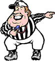
What we want to do is to have the text aligned to the RIGHT of the IMAGE. There are a few ways to accomplish this.
 The offical record
will
be reviewed
by the Appeals
Commission
Speaking of appeal. This doesn't have to much!!!
<IMG SRC="referee.gif" WIDTH=110 HEIGHT=123>
<P ALIGN=RIGHT>The offical record<br>will be reviewed<br>by the Appeals<br>Commission

The offical record
will be
reviewed
by the Appeals
Commission
As you can see, the text did align right, but the result was not very satisfactory.
<IMG SRC="referee.gif" WIDTH=110 HEIGHT=123 ALIGN=LEFT>The offical record<br>will be reviewed<br>by the Appeals<br>Commission
 The offical record
will be reviewed
by the Appeals
Commission
This is an improvement, but as you can see the text is to close to the image and a little too high. The height can be easily fixed by inserting the appropiate no of <BR>'s preceeding the text.

The offical
record
will be reviewed
by the
Appeals
Commission
That's got the height problem solved.
<IMG SRC="referee.gif" WIDTH=110 HEIGHT=123 ALIGN=LEFT hspace="35"><BR><BR>The offical record<br>will be reviewed<br>by the Appeals<br>Commission

The offical record
will be reviewed
by the
Appeals
Commission
are used. NOTE Web Tv permits the use of color names, that may be found in The Professor's Color Chart.
<TABLE BGCOLOR="blue"
WIDTH=350 HEIGHT=250
BORDER=5>
<TR><TD ALIGN=CENTER>
<TABLE BGCOLOR="black"
WIDTH=350 HEIGHT=250
BORDER=0>
<TR><TD ALIGN=CENTER WIDTH=175>
<FONT COLOR=WHITE>Here is<p>How we
align<p>text
to left<p>of The
Professor</FONT>
</TD><TD ALIGN=CENTER WIDTH=175>
<IMG SRC="grad.gif" WIDTH=152
HEIGHT=199>
</TD></TR></TABLE>
</TD></TR></TABLE>
|
<TABLE BGCOLOR="blue"
WIDTH=350 HEIGHT=250
BORDER=5>
<TR><TD ALIGN=CENTER>
<TABLE BGCOLOR="black"
WIDTH=350 HEIGHT=250
BORDER=0>
<TR><TD ALIGN=CENTER WIDTH=175>
<IMG SRC="grad.gif" WIDTH=152
HEIGHT=199>
</TD><TD ALIGN=CENTER WIDTH=175>
<FONT COLOR=WHITE>Here is<p>How we
align<p>text to right<p>of The
Professor</FONT>
</TD></TR></TABLE>
</TD></TR></TABLE>
|
<TABLE BGCOLOR="blue" BORDER=5>
<TR><TD ALIGN=CENTER>
<IMG SRC="grad.gif" WIDTH=152 HEIGHT=192>
</TD></TR></TABLE>

|
Now we will make a table to demonstrate how to put text to the LEFT of an IMAGE and to the RIGHT of the image.
The RED table will be the border. The BLACK table will have three <TD> Table Data cells that will contain the text and the image. The BLUE table will contain the image used in the center <TD> Table Data cell in the BLACK Table.
<TABLE BGCOLOR="red" BORDER=5 HEIGHT=250
WIDTH=400>
<TR><TD ALIGN=CENTER>
<TABLE BGCOLOR="black" BORDER=0 HEIGHT=250
WIDTH=400>
<TR><TD ALIGN=CENTER WIDTH=33%>
<FONT COLOR="white">
<STRONG>
This Is How<BR>
To Put Text<BR>
To The Left<BR>
Of The<BR>
Professor
</STRONG></FONT>
</TD><TD>
<TABLE BGCOLOR="blue" BORDER=5>
<TR><TD>
<IMG SRC="grad.gif" WIDTH=152 HEIGHT=192>
</TD></TR></TABLE>
</TD><TD ALIGN=CENTER WIDTH=33%>
<FONT COLOR="white">
<STRONG>
This Is How<BR>
To Put Text<BR>
To The Right<BR>
Of The<BR>
Professor
</STRONG></FONT>
</TD></TR></TABLE>
</TD></TR></TABLE>
|
In case you were wondering why the record was being sent to the Appeals Commission
| The referee decided, upon viewing the replay, that |  |
the official record would be reviewed by the Appeals Commission |
| The Professor's Table | ||||
| Lesson No 1 | Lesson No 2 | Lesson No 3 | Lesson No 4 | Lesson No 5 |
THE PROFESSOR